 labsUI
SaaS landing
A landing page for a software product in euros: hero, features, customer quotes, plans with monthly and yearly billing, an FAQ, a newsletter and a footer.
Open demo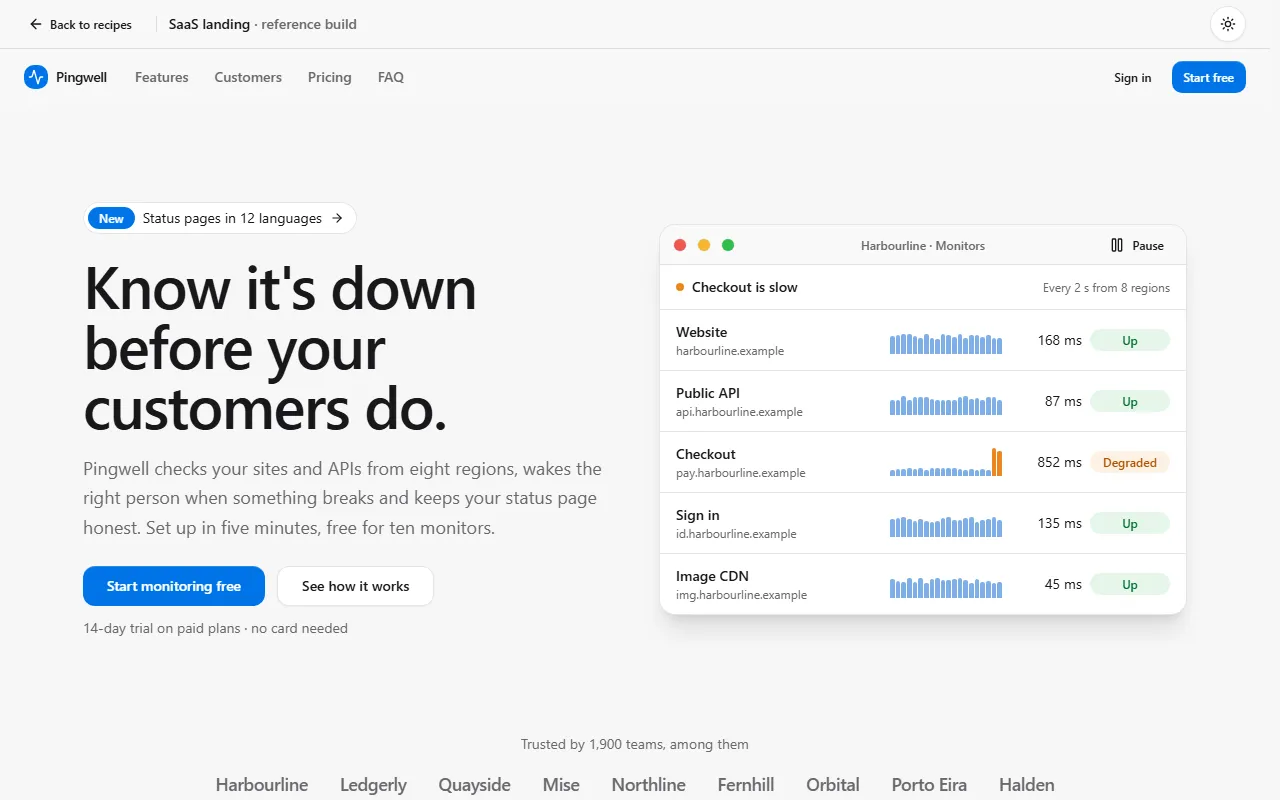
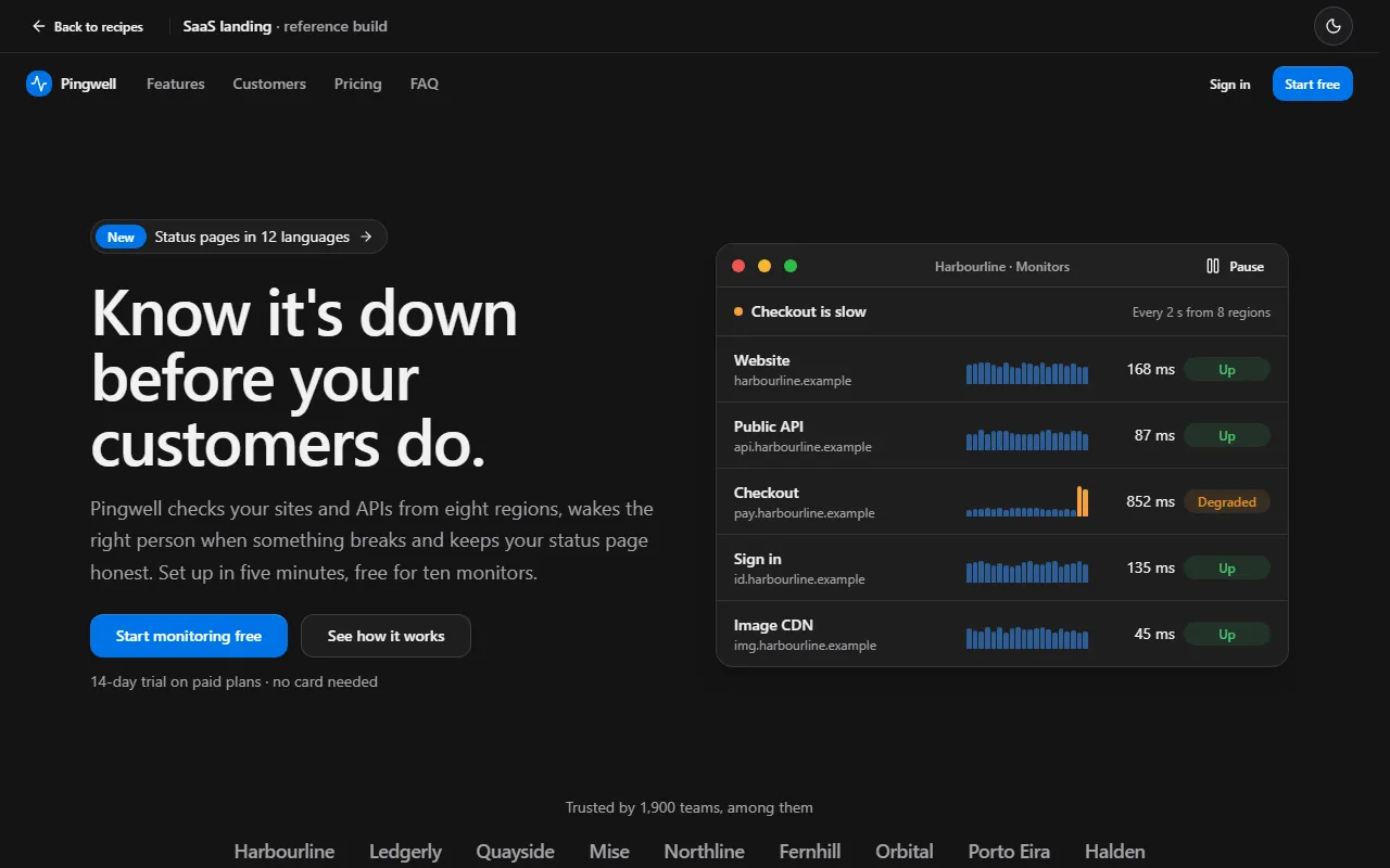
Prompt
Using labsUI, build a landing page for an uptime monitor for small web agencies, prices in EUR, all text in English. The page is the product: the hero is a working mini demo, a status board of five client sites with response-time charts, and a "simulate an outage" button that turns one site red, raises an alert toast and writes the incident onto a public status page beside it. The headline says exactly what it does, set large in a serif display font from `next/font`; one primary button and a text link. Then tell one story in three alternating rows (the outage at 3 a.m., the alert, the page the client reads), pricing with a monthly and yearly switch and a slider for the number of monitors that shows the exact bill, a short "not for you if" list, one quote from a named customer, the last three changelog entries with dates, an FAQ and a footer with a wide brand column. Light first, sample data. Pick one accent preset that fits, not the default blue. Avoid a small label above every heading, a centered hero with two equal buttons, three equal feature cards and round numbers like 10,000+.
Checked on labsUI 0.2.3 with Claude Sonnet, November 9, 2026: a fresh Next.js 16 app, the agent using only the labsUI MCP server. Its build passed and axe found no violations from labsUI.
The raw run
The checked run's own result, before any polish: what the prompt alone got.
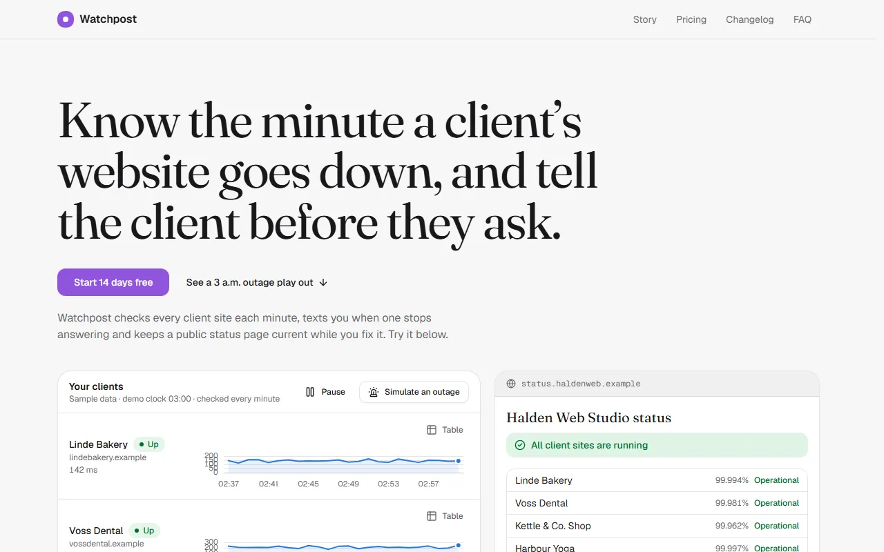
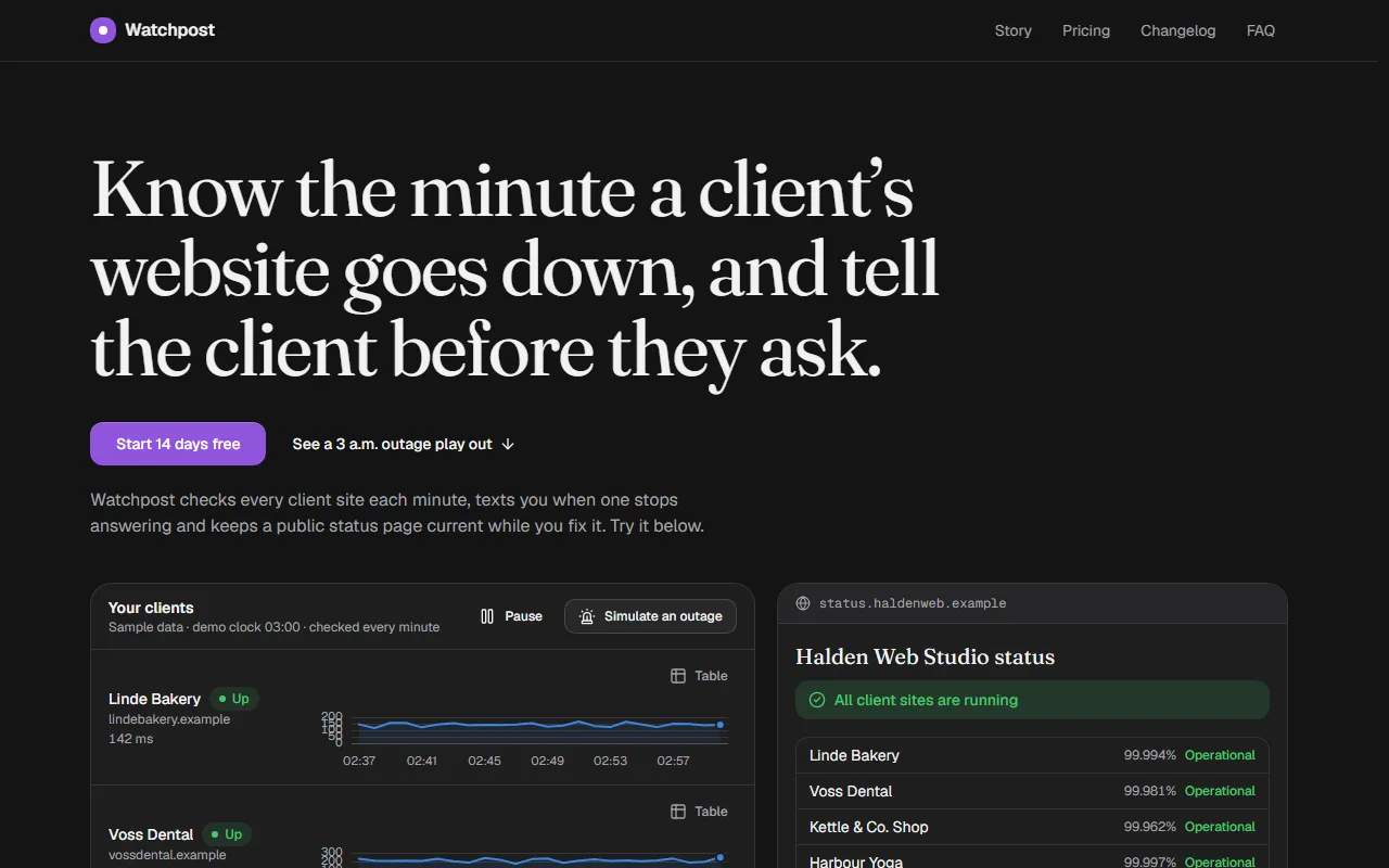
Components it uses
The agent adds these itself. To start by hand, after npx @kznlabs/labsui init:
What the result needs
Hero brings its own room
Hero centers itself at max-w-7xl with its own padding, so a wrapper with more padding doubles the gap above the title (the checked run had about 160 px of empty space under the header). Pass className to Hero instead, and let media hold the product: a screenshot, or a live window that moves needs a pause (WCAG 2.2.2).
One period for every plan
Pricing keeps one period for all its plans and rolls each price when it changes. Keep priceNote to “/ month” in both periods (a free plan shares it, and “€0 billed yearly” reads oddly), let the period's note say what it gives in words that hold for every plan (“2 months free”), and show the yearly total beside the plans. cta can be a function of the period, so a trial button knows what was picked.
<Pricing currency="EUR" locale="en-IE" periods={[ { value: "monthly", label: "Monthly", priceNote: "/ month" }, { value: "yearly", label: "Yearly", note: "2 months free", priceNote: "/ month" }, ]} plans={plans.map((plan) => ({ ...plan, cta: (period) => <Button onClick={() => startTrial(plan.id, period)}>Start 14-day trial</Button>, }))}/>A plan that follows the visitor
featured and badge are plain props, so they can come from state: a Slider for how many seats or monitors someone needs can mark the smallest plan that fits as “Best fit”, and a ComparisonTable under a Collapsible holds every feature without making the page longer.
Signup and newsletter without a backend
A plan's button can open a Dialog with Field-wrapped email and name inputs; the sample answers with a toast. Newsletter's onSubscribe returns a promise: a rejection's message becomes the error toast, so a Server Action that throws “Already subscribed” needs no extra UI.